#scrollable layout
Explore tagged Tumblr posts
Visit Tumblr Blog
Explore Tumblr blogs with no restrictions, modern design and the best experience.
Last Seen Tumblr Blogs


Fun Fact
The average Tumblr user visits about 67 pages every month.
Text
Land of the Lost
🧩 Author: CalsCode 🔗 Code Link: 「F2U」Land of the lost on Toyhouse 💠 Use Type: Free to Use (F2U) 📄 Purpose: World Layout 📝 Description: A soft, atmospheric world code designed for Toyhou.se’s world/roleplay communities. This layout features organized sections for group info, staff, events, and affiliates, all wrapped in a serene background theme. Built for easy readability and expansion, it includes scrollable content boxes and character avatar grids to showcase key members and updates. Ideal for storytelling hubs, species worlds, fandom groups, or creative social spaces.
📷 Previews:
#toyhou.se code#world layout#f2u#community hub#group page#roleplay world#scrollable layout#html layout#toyhouse resources#group management#calscode#worldcodes
2 notes
·
View notes
Note
hi there!! there isn’t a need to publish this ask I literally just am so curious if you had any resource or tutorial regarding your neocities! I’m sorry if this is so out of the blue but I saw your site and really adored the layout!! I’m specifically just wondering about the method you used for your blog posts - I’ve found some recommended ways to do it but i feel like yours is integrated really well imo :) also if you’re not comfortable answering or anything that’s totally fine lol pls don’t feel obligated. lastly your art is so gorg!!!
i'm finally going to answer this ask...!! it's going to be a very long read so i'll keep it all under this cut
i know you are specifically curious about the blog posts page but i figured this was a great time to thoroughly explain my website layout too since i had another person asking about it (i'll put that at the bottom though) :D
please bear with me btw because i... i have never made a tutorial like this before LOL
--
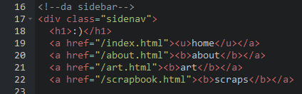
blog posts guide

1. scrollbox
i made a super low effort format for my blog entries. i honestly just wanted it to be a super simple scrollable box with all of my entries being in one general place. CSS to do this, i created an all encompassing <div class> that had the styling property of overflow.
fyi, i also added a <div class> within the scrollbox class that would handle the padding but TBH i'm not sure... i needed to make an entire class for that LOL REFERENCES - scroll box
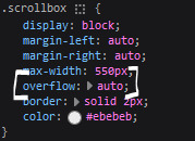
2. date & time
HTML ok honestly i just used a <p> element and made it bold....
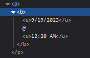
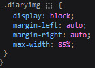
3. images (optional)
HTML i don't always attach an image to my entries but when i want to, i use this <div class> that sits below my date & time. i style it with an <img class> that i created and add an <alt text> too to make it more accessible!
CSS this is what the <img class> looks like. i like my images centered and on their own "line."
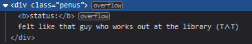
4. status
HTML again, another <div class> specifically made for the status. i just made the font size smaller to visually differentiate it from the actual entry itself.
5. blog entry text
HTML my blog entries are simply typed up between <p> tags and i use <br> to start a new line... it literally just looks like this LOL....

THAT'S ALL...>!!!!!! :)
--
website guide

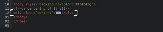
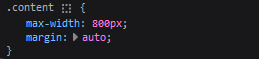
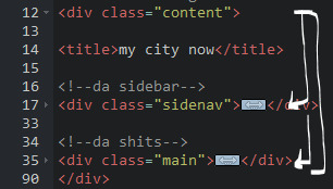
1. general page layout
HTML in order to establish where i want all of my blog's content to lie, i created a <div class> specifically to store it all.
CSS the styling for it is pretty simple! just setting a max-width to limit the size of everything that will be in it and also centering the page with the margin.
2. sidebar
HTML my sidebar just comprises of a heading tag and navigation links.
CSS this is all personal taste aside from the fixed position
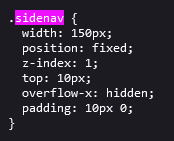
REFERENCES - fixed sidebar - responsive sidebar
3. main content
HTML because everything is stored in the <div class="content">, the sidebar and the page contents are limited to the constraints of the it.
that is all pt. 2...... bless <3
#THANK U FOR ASKING BTW!!!!#it brings me so much joy when people ask me . things and i then get to answer these things#i am so sory if this is somewhat incomprehensible or a pain to read through IF YOU HAVE ANY NEEDS FOR CLARIFICATION... JUST ASK ME..!!!!#textoffun#inbox
32 notes
·
View notes
Text
Let's break it down...
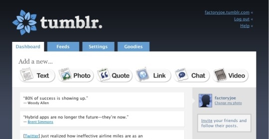
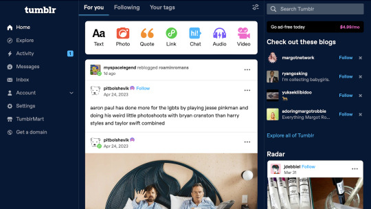
Tumblr Dashboard; 2007
Tumblr has always aimed for one thing: interconnectivity between people to form a community of those who share similar interests and beliefs. The original layout design of the app was simple and to the point, encouraging microblogging interactions and prolonged content viewing.
The interface of a Tumblr post has remained relatively similar throughout the years. Pictured above is the tumblr dashboard in april 2007, where a post could consist of a text, photo, quote, link, chat, or video. A dashboard to home all of your followings postings, as well as a feed to recommend newer, discovery-worthy content.

Tumblr Dashboard; 2011
Over time, the Tumblr dashboard remained strong in its design, only adding audio as a possible addition to any post. However, now you were boldy presented with how many people you are following as well as how many posts you've interacted with overall. Tumblr also adapted it's iconic indented layout, allowing comments and replies from users to be connected by bars,
such as this!
Tumblr Dashboard; 2024
The labels of the community are split into two: post-creating and post-viewing. This summarizes in the simplest way the function of Tumblr; to engage or to intrigue users into engaging.
When you first log into Tumblr, you are presented with the classic layout of a scrollable For You page (alongside a Following & Your tags), where you are encouraged to scroll and check out the latests post categorized by who and what tags you follow, as well as recommended content. This is all presented on the Home page, where you are prompted to make a posts at the very top, ushered to follow blogs that revolve around your similar interests, and prompts to further explore deeper into Tumblr where your interest typically would not lead you. Then, there is the explore page. This is where you can dive into an entirely new world of topics and conversations, ones not often found on your perfectly-curated For You page. While there is a section still recommending topics you are following, a majority of the Explore page is there to push you towards similar, yet branched out subjects that expand on what they already know about you. For example, I am into #yellowjackets, so why would I not also be interested in #cultmedia #sapphics #girlsgonewild & #splatterpunkbooks?
Activity, Messages, and Inbox all manage user interactions across the platform. Activity allows you to see how your friends or followers receive a post, sharing when if it was reblogged, liked, or created conversation. Messages and Inbox are relatively the same, but you can only send outgoing mail through Messages, and receives responses through your Inbox. It allows for a cleanliness, especially for larger blogs, while also posing a disconnect.
The Settings tab is similar in its layout to many social media platforms, giving you access and the availability to manipulate your account in whatever way you see fit. You can adjust the content you're seeing by blocking tags and bloggers, as well as filtering themes such as Drug Use, Violence, etc. In the same place, you are able to adjust your username or enact further Tumblr features that are in beta, called Tumblr Labs, "a collection of experiments we're working on that might turn out to be useful, fun, both, or neither." Tumblr allows you to manage any finances connected to your account, while simultaneously encouraging the user to give in to their small frees to allow for ad-free viewings of the app or having your very own, unique domain.
Tumblr Mart is one of the central monetization tactics used on the app. Badges, subscriptions, checkmarks, all at the tip of your fingers to further dazzle your blog, increase traffic, and showcase even more about you than was possible before. Purchase a zodiac badge to connect with your fellow Sagittarius', or showcase your playlist badge to let other bloggers know you have a wicked music taste. The Tumblr Mart encourages not only the beautifying of your own blog, but it encourages gifting other users matching badges or personal subscriptions as a means of showing affection. Love across the internet is just as powerful, right?

2 notes
·
View notes
Note
bro every time i scroll through your lists it wants me to sign in to tumblr when im literally using my tumblr account wtf does it want
Are you on mobile, bro? It does the same thing to me on mobile and it’s literally my own blog. If you can’t get on desktop, the links in the Collections page will work on mobile - but they’re to all the posts in a scroll, not the nice grid layout. Also the search will show you the posts in a scrollable format on mobile.
6 notes
·
View notes
Text
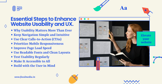
How to Make Your Website Easy to Use

Introduction: Why Usability Matters More Than Ever
In a digital-first world, a website is often your brand’s first impression. But a beautiful site is useless if visitors can’t navigate it easily. Website usability, the ease with which users can interact with your site, directly impacts engagement, conversions, and customer satisfaction. A user-friendly website isn’t just good design; it’s smart business.
Keep Navigation Simple and Intuitive
Clear Menus and Logical Structure
Visitors should find what they’re looking for within a few clicks. A cluttered or confusing menu can cause users to leave quickly.
Best practices:
Use a clear, consistent top navigation bar
Group similar pages together logically
Include a search bar for quick access
Avoid Deep Navigation Trees
Too many nested pages can frustrate users. Stick to a simple hierarchy that lets users know exactly where they are and how to get back.
Use Clear Calls-to-Action (CTAs)
Guide Users Purposefully
A strong CTA tells users what action to take next, whether that’s signing up, buying a product, or contacting you.
Tips for better CTAs:
Use action-oriented language like “Get Started” or “Download Now.”
Place CTAs above the fold and at the end of the content
Make buttons bold, colorful, and easy to tap
Prioritize Mobile Responsiveness
Design for All Devices
With mobile traffic dominating the web, your site must function just as well on a phone as it does on a desktop.
Mobile-friendly essentials:
Use responsive design frameworks
Ensure buttons are finger-friendly
Keep content concise and scrollable
Improve Page Load Speed
Faster Sites = Happier Users
Slow-loading pages can quickly lose user interest. A fast website helps retain visitors and improve SEO.
Quick fixes to boost speed:
Compress images without losing quality
Use browser caching and a content delivery network (CDN)
Minimize JavaScript and CSS bloat
Use Readable Fonts and Clean Layouts
Make Content Easy to Digest
If your text is too small or your layout is too busy, users will leave quickly. Focus on clean design and readability.
Readability tips:
Choose legible fonts (sans-serif works well)
Keep paragraph lengths short
Use white space to avoid visual clutter
Test Usability Regularly
Know How Users Interact
What you think is user-friendly might not be in reality. Usability testing ensures that your site works the way users expect it to.
How to test usability:
Use tools like Hotjar or Google Analytics for behavior tracking
Run A/B tests to see what works
Collect user feedback through surveys or session recordings
Make It Accessible to All
Inclusive Design Helps Everyone
Your site should be usable by people with disabilities. Accessibility isn’t optional, it’s part of great UX.
Accessibility essentials:
Add alt text to images
Use high-contrast color schemes
Enable keyboard navigation and screen reader support
Conclusion: Build with the User in Mind
Creating a user-friendly website isn’t a one-time task; it’s an ongoing commitment. By focusing on intuitive design, mobile responsiveness, fast performance, and accessibility, you create a website that delights visitors and drives results.
Need help improving your site’s usability? Focal Media can help you design seamless digital experiences that users and search engines love.
0 notes
Text
The Role of Color and Typography in Creating Impactful Annual Reports
Annual Report Design Examples: Frequently Asked Questions Explained
1. What are the key elements that should be included in an effective annual report design to enhance readability and engagement?
An effective annual report design should include a clear and consistent layout, concise and engaging text, informative visuals (charts and graphs), a logical flow of information, ample white space for easy reading, and a visually appealing cover. Additionally, incorporating key highlights and summaries can enhance engagement and ensure important information is easily accessible to readers.
2. How do color schemes and typography choices in annual report designs influence the perception of a company's brand and values?
Color schemes and typography in annual reports significantly influence brand perception by conveying emotions and values. For instance, bold colors suggest innovation and confidence, while softer tones imply trust and stability. Typography choices, whether modern or traditional, reflect a company’s personality. Together, these elements create a cohesive message about the company's identity and priorities, shaping stakeholder perceptions.
3. Can you provide examples of innovative layouts or formats used in recent annual reports that successfully convey complex data in a visually appealing manner?
Recent annual reports have embraced infographics, interactive digital formats, and modular designs. Examples include visual storytelling with data visualizations, the use of icons to simplify statistics, and scrollable web formats that allow for dynamic engagement. Notable companies like and have effectively utilized these techniques to present complex information in an accessible and visually appealing way.
4. What role does storytelling play in annual report design, and how can visual elements be utilized to support a narrative effectively?
Storytelling in annual report design conveys a company's journey, values, and achievements, engaging stakeholders. Visual elements like infographics, charts, and images enhance the narrative by illustrating data, making complex information accessible and memorable. Consistent branding and layout further reinforce the story, creating a cohesive and compelling report that resonates with the audience.
5. How can companies incorporate sustainability and social responsibility themes into their annual report designs to reflect their commitment to these values?
Companies can incorporate sustainability and social responsibility themes in their annual reports by highlighting eco-friendly initiatives, using sustainable materials, showcasing community impact stories, and including transparent metrics on environmental and social performance. Visuals like infographics can effectively communicate these efforts, while dedicated sections for sustainability goals and achievements reinforce their commitment to these values.

Visit: VS Website See: VS Portfolio
0 notes
Text
Top 10 Flutter Widgets You Should Master for Better UI Design
Flutter has revolutionized the way developers build beautiful, high-performance mobile apps. One of the most powerful features of Flutter is its rich collection of widgets — reusable UI components that allow you to craft stunning interfaces with ease. Whether you're a beginner or an experienced developer, mastering the right widgets can dramatically improve your app's design, usability, and performance.
In this article, we’ll explore the top 10 Flutter widgets you should master to take your UI design skills to the next level.
1. Container
The Container widget is like the Swiss Army knife of Flutter. It’s incredibly versatile, allowing you to customize margins, padding, background colors, borders, and more. Whether you're wrapping text, images, or entire layouts, Container provides the flexibility needed to create structured and visually appealing designs.
Pro Tip: Combine Container with BoxDecoration to add gradients, shadows, and rounded corners for a more polished look.
2. Row and Column
At the core of any UI layout in Flutter are the Row and Column widgets. These essential widgets allow you to arrange your child widgets horizontally (Row) or vertically (Column). Proper mastery of alignment, spacing, and nested Rows/Columns is critical for crafting intuitive and responsive UIs.
Best Practice: Always think about responsiveness and scalability when nesting multiple Rows and Columns.
3. Stack
The Stack widget lets you place widgets on top of each other — perfect for creating complex UI elements like banners, overlays, and card layouts. With Stack, you can control the positioning of elements freely and create dynamic, layered designs.
Use Case: Think about building profile screens where a user's picture overlaps a background cover image.
4. ListView
Handling scrollable content is made easy with ListView. It's a scrollable list of widgets that can be built statically or dynamically with ListView.builder. Mastering ListView allows you to handle data efficiently while providing a seamless scrolling experience for users.
Pro Tip: Use ListView.separated to create list items with custom separators for better UI organization.
5. GestureDetector
GestureDetector brings interactivity to your apps by detecting user gestures like taps, drags, and swipes. This widget is essential for building custom buttons, swipeable cards, and interactive elements without relying solely on prebuilt components.
Example: Implement a swipe-to-delete functionality using GestureDetector with Dismissible widgets.
6. CustomPaint
If you want to create custom designs, animations, or complex UI elements, CustomPaint is your go-to widget. It provides a canvas where you can draw shapes, paths, and other graphic elements, offering ultimate creative freedom.
Best for: Developers who want to build unique visual elements like charts, graphs, or custom backgrounds.
7. AnimatedContainer
Flutter is known for its smooth animations, and AnimatedContainer makes it easy to animate changes in your UI. Whether you’re changing colors, dimensions, or positioning, AnimatedContainer adds fluid transitions without much code.
Tip: Use AnimatedContainer when toggling UI states to make your apps feel more dynamic and alive.
8. Hero
Hero widget enables seamless transition animations between screens by "flying" an element from one page to another. It's incredibly effective for creating visually engaging navigation experiences, particularly for images or product details in ecommerce apps.
Best Use Case: Use Hero animations in onboarding flows or product catalogs to create an immersive experience.
9. Form and TextFormField
Handling user input? The Form widget, combined with TextFormField, is your best friend. These widgets allow you to easily manage user input fields, validations, and form submissions. Mastering these will ensure your apps collect and handle data effectively.
Pro Tip: Always validate user inputs to enhance user experience and prevent errors.
10. SliverAppBar
For advanced scrolling effects, SliverAppBar is a must-learn widget. It allows your app bar to expand, collapse, and even float as you scroll, adding a sophisticated touch to your app’s UI.
Use Case: Create dynamic pages where headers shrink while content scrolls, perfect for news apps or product listings.
Conclusion
Mastering these top Flutter widgets will not only elevate your app's design but also make your development process smoother and more efficient. From layout to animation, these widgets provide the building blocks for creating modern, engaging, and responsive mobile applications.
If you are looking to build a cutting-edge Flutter application that stands out in today’s competitive market, partnering with a Top Flutter App Development Company can make all the difference. With the right expertise, you can bring your vision to life with pixel-perfect design and outstanding performance.
0 notes
Text
Mastering Flutter UI: A Deep Dive into Essential Widgets
Flutter has become the go-to framework for developers aiming to create beautiful, natively compiled applications for mobile, web, and desktop from a single codebase. One of Flutter's biggest strengths lies in its rich set of UI components. In this blog, we’ll explore five powerful Flutter widgets you should know to build smooth, feature-rich apps: RadioListTile, Card, Badge, Carousel, and Tab widgets.
Let’s break them down one by one 👇
Flutter RadioListTile
If you're looking to implement multiple-choice or preference selection in your app, RadioListTile is a clean and user-friendly way to go. It’s a combination of a radio button and a ListTile, offering an interactive selection item with built-in tap response and styling.
Use Case: Perfect for forms, settings screens, and user surveys.
Key Features:
Combines Radio and ListTile in one widget
Automatically manages selection logic
Easily styled and customized
Explore Flutter RadioListTile →
Flutter Card Widgets
The Card widget is your go-to for building polished, material-style containers that can hold content and actions. Whether you're listing profiles, products, or posts, Cards offer a neat, elevated look with built-in shadows and padding.
Use Case: Ideal for displaying grouped information, like user profiles, news snippets, or dashboard tiles.
Key Features:
Elevation for depth effect
Rounded corners and padding
Works seamlessly with images, text, and buttons
Explore Flutter Card Widgets →
Flutter Badge Widgets
Badges are tiny but mighty UI elements used to convey notifications, updates, or status indicators. In Flutter, Badge widgets can be easily integrated with icons or buttons to highlight new content or activity counts.
Use Case: Useful in apps with notifications, messages, or shopping carts.
Key Features:
Lightweight and customizable
Can be styled with numbers, icons, or colors
Typically used alongside BottomNavigationBar or AppBar
Explore Flutter Badge Widgets →
Flutter Carousel Widgets
The Carousel widget brings dynamic image sliders or content carousels into your app with swipe support and animations. It’s often seen on landing pages, featured product sections, or onboarding flows.
Use Case: Great for showcasing banners, promotions, or featured content.
Key Features:
Swipeable image/content sliders
Autoplay and manual control options
Customizable indicators and transitions
Explore Flutter Carousel Widgets →
Flutter Tab Widgets
Organizing content in a clean and swipeable layout? Flutter’s TabBar and TabBarView combo is your solution. It allows users to switch between sections smoothly—perfect for settings screens, app categories, or dashboards.
Use Case: Best used for apps with segmented content like music, shopping, or news.
Key Features:
Horizontal tab navigation
Syncs easily with content views
Can be scrollable or fixed
Explore Flutter Tab Widgets →
Wrap-Up
These Flutter widgets—RadioListTile, Card, Badge, Carousel, and Tab—are staples in modern app development. They not only help improve UX but also allow developers to maintain a consistent and elegant UI throughout the app.Want to dig deeper into each widget? Visit our website for more, visit Getwidget.
0 notes
Text
Getting Started with Mobile App Development using Flutter

Flutter is an open-source UI software development kit created by Google. It allows developers to build beautiful, natively compiled mobile, web, and desktop applications from a single codebase. In this post, we’ll explore the basics of Flutter and how to start building your own mobile apps.
Why Choose Flutter?
Cross-platform: Write once and run on both Android and iOS.
Fast Development: Features like hot reload make development quicker.
Beautiful UI: Comes with pre-built widgets that look great and feel native.
Strong Community: Backed by Google and has a large, active developer base.
Setting Up Your Flutter Environment
Download and install Flutter SDK from flutter.dev.
Install Android Studio or Visual Studio Code as your IDE.
Run flutter doctor in your terminal to verify your setup.
Create a new project with flutter create my_app.
Your First Flutter App
Here's a simple example of a Flutter app that displays "Hello, Flutter!" on the screen:import 'package:flutter/material.dart'; void main() { runApp(MyApp()); } class MyApp extends StatelessWidget { @override Widget build(BuildContext context) { return MaterialApp( home: Scaffold( appBar: AppBar(title: Text('Flutter Demo')), body: Center(child: Text('Hello, Flutter!')), ), ); } }
Core Concepts in Flutter
Widgets: Everything in Flutter is a widget, including layout, text, and styling.
State: Manage app data using Stateful and Stateless widgets.
Navigation: Navigate between screens using routes and the Navigator API.
Packages: Add functionality via packages from pub.dev.
Useful Flutter Widgets
Container – Box model widget for layout
Column / Row – Layout children vertically or horizontally
TextField – User input field
ListView – Scrollable list of widgets
ElevatedButton – Clickable button with style
Tips for Beginners
Use Hot Reload to see changes instantly without restarting the app.
Start with basic UI, then gradually add interactivity and logic.
Break your app into small widgets to keep code clean and reusable.
Explore the official Flutter documentation.
Popular Apps Built with Flutter
Google Ads
Alibaba
Reflectly
eBay Motors
Conclusion
Flutter makes mobile app development fast, flexible, and fun. With just a bit of practice, you can start building cross-platform apps that look great and perform smoothly. Whether you're a beginner or coming from another framework, Flutter is worth exploring.
0 notes
Text
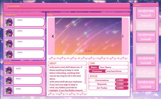
Nitrome
🧩 Author: randygrim 🔗 Code Link: Nitrome User Code on Toyhouse 💠 Use Type: Free to Use (F2U) 📄 Purpose: User Profile 📝 Description: An ultra-sweet and nostalgic profile code with a webcore/y2k aesthetic, perfect for users who want to display characters, friends, stamps, and personal info in one place. This layout features sliding image galleries, scrollable info panels, and an adorable pink-purple color palette loaded with sparkles and rounded buttons. Great for those who love cute, expressive, and visually engaging profiles.
📷 Previews:
#toyhouse code#user profile#cute layout#y2k aesthetic#pink code#sparkle theme#webcore#pastel aesthetic#html layout#oc showcase#friend display#usercodes#randygrim#f2u
15 notes
·
View notes
Text
Enable Expanded Start Menu in Windows 11
This article explains how to enable the expanded Start menu that displays all pins in Windows 11. In Windows 11’s latest builds, Microsoft is experimenting with a new start menu with a bigger layout that lets users show all pins by default. The new feature combines the “All” menu and “Pinned” and “Recommended” sections into a larger, scrollable layout. To try this experiential feature, use the…
0 notes
Text
How to use HarmonyOS NEXT - List Layout?
A list is a complex container that automatically provides scrolling functionality when the number of items in the list reaches a certain level and the content exceeds the screen size. It is suitable for presenting similar data types or datasets, such as images and text. Displaying a dataset in a list is a common requirement in many applications, such as contacts, music lists, shopping lists, etc.
Using lists can easily and efficiently display structured and scrollable information. By linearly arranging the sub components ListItemGroup or ListItem vertically or horizontally in the List component, a single view is provided for the rows or columns in the list, or a loop rendering is used to iterate a set of rows or columns, or any number of individual views and ForEach structures are mixed to construct a list. The List component supports generating sub components using rendering control methods such as conditional rendering, loop rendering, lazy loading, etc.
interface [code] List(value?:{space?: number | string, initialIndex?: number, scroller?: Scroller}) [/code]
List contains ListItem and ListItemGroup sub components. The sub components of List must be ListItemGroup or ListItem, and ListItem and ListItemGroup must be used in conjunction with List.
Rendering list data through ForEach loop Code Examples [code] @Entry @Component struct ListPage { @State message: string = 'List Layout';
cities:Array=[ '北京市','上海市','广州市','杭州市','东莞市' ]
@Builder groupHeader(text: string) { Text(text) .fontWeight(FontWeight.Bold) .backgroundColor(Color.Orange) .width('100%') .padding(4) .textAlign(TextAlign.Center) }
build() { Column() { Text(this.message) .fontSize(30) .fontWeight(FontWeight.Bold) List() { ListItem() { Text('北京') } ListItem() { Text('上海') } ListItem() { Text('广州') } ListItemGroup({ header: this.groupHeader('一线城市')}){ ListItem() { Text('北京') } ListItem() { Text('上海') } ListItem() { Text('广州') } } ListItemGroup({header:this.groupHeader('循环遍历')}){ ForEach(this.cities,(item:string)=>{ ListItem(){ Text(item) } }) } } .backgroundColor('#EEEEEE') .alignListItem(ListItemAlign.Center) } .height('100%') .width('100%')
} } [/code]
Add a dividing line ·List provides a divider attribute to add separators between list items. When setting the divider property, the thickness and color of the separator can be set through the strokeWidth and color properties. ·The startMargin and endMargin properties are used to set the distance between the separation line and the starting end of the side of the list, and the distance from the end of the side of the list, respectively.
Code Examples [code] class DividerTmp { strokeWidth: Length = 1 startMargin: Length = 60 endMargin: Length = 10 color: ResourceColor = '#ffe9f0f0'
constructor(strokeWidth: Length, startMargin: Length, endMargin: Length, color: ResourceColor) { this.strokeWidth = strokeWidth this.startMargin = startMargin this.endMargin = endMargin this.color = color } } @Entry @Component struct EgDivider { @State egDivider: DividerTmp = new DividerTmp(1, 60, 10, '#ffe9f0f0') build() { List() { // … } .divider(this.egDivider) } } [/code]
scroll bar When using the List component, the display of the list scrollbar can be controlled through the scrollBar property. The value type of scrollBar is BarState. When the value is BarState Auto means to display scrollbars as needed. At this point, when touching the scrollbar area, the control is displayed. You can drag the scrollbar up and down to quickly browse the content, and it will become thicker when dragged. If no action is taken, the scrollbar will automatically disappear after 2 seconds. [code] List() { // … } .scrollBar(BarState.Auto) [/code]
0 notes
Text
Understanding Flutter Widgets: The Building Blocks of UI

Introduction
Flutter has rapidly emerged as one of the most popular frameworks for cross-platform app development. Known for its fast development cycle, beautiful UI components, and seamless performance, Flutter is widely adopted by developers worldwide. At the core of Flutter’s functionality lies its powerful widget-based architecture.
Whether you are building a simple application or a complex one, Flutter widgets play a crucial role in shaping the user interface (UI). In this article, we will explore what Flutter widgets are, their types, and why they are essential for app development. If you’re looking to master Flutter development, consider Flutter Training in Chennai, which provides hands-on experience in building UI with widgets.
What Are Flutter Widgets?
A widget in Flutter is a UI component that controls a part of the screen. Every UI element in a Flutter app, from a simple button to a complete screen layout, is made up of widgets. Flutter follows a widget tree structure, meaning widgets are nested within each other to create complex user interfaces.
Why Widgets Are Important in Flutter
Reusability – Widgets can be used multiple times across different parts of the app.
Customization – Widgets allow developers to create unique UI experiences.
Hot Reload – Changes made to widgets can be instantly reflected in the app.
Cross-Platform Development – Widgets enable seamless UI creation for Android, iOS, web, and desktop.
Types of Flutter Widgets
Flutter offers a rich set of widgets that developers use to build stunning interfaces. These widgets are primarily classified into two categories: Stateless Widgets and Stateful Widgets.
1. Stateless Widgets
Stateless widgets are immutable, meaning their properties do not change once they are created. They are used when the UI does not require updates based on user interaction or dynamic data changes.
Examples of Stateless Widgets:
Text Widget – Displays text on the screen.
Image Widget – Loads images from assets, network, or file.
Icon Widget – Displays icons from Flutter’s icon library.
RaisedButton – A simple button with elevation.
2. Stateful Widgets
Stateful widgets are dynamic and can change based on user interactions, API responses, or other factors. They maintain a state that can be modified during the app’s lifecycle.
Examples of Stateful Widgets:
TextField – Accepts user input dynamically.
Checkbox – Allows toggling between checked and unchecked states.
Slider – Provides a sliding control for setting values.
ListView – Displays a scrollable list of widgets.
Key Flutter Widget Categories
Apart from Stateless and Stateful widgets, Flutter provides several widget categories to enhance app development.
1. Layout Widgets
Layout widgets help structure the UI elements effectively.
Column – Arranges widgets vertically.
Row – Arranges widgets horizontally.
Stack – Overlaps widgets on top of each other.
Container – Provides padding, margins, and background properties.
2. Input Widgets
These widgets facilitate user interaction.
TextField – Enables text input.
DropdownButton – Displays a list of selectable options.
Switch – Toggles between on/off states.
3. Styling Widgets
Styling widgets enhance the visual appearance of the UI.
Padding – Adds space around a widget.
Align – Aligns widgets within their parent container.
DecoratedBox – Applies decorations like colors, gradients, and borders.
4. Scrolling Widgets
Scrolling widgets help manage content overflow.
ListView – Creates a scrollable list.
GridView – Arranges widgets in a grid format.
SingleChildScrollView – Allows a single widget to be scrollable.
5. Interactive Widgets
These widgets enable user interaction.
GestureDetector – Detects gestures like taps and swipes.
InkWell – Provides visual feedback on touch.
FloatingActionButton – A button that performs primary app actions.
How Flutter Widgets Improve UI Development
1. Faster Development with Hot Reload
One of the biggest advantages of Flutter’s widget system is Hot Reload, which allows developers to instantly see the changes they make without restarting the app.
2. Consistent UI Across Platforms
Flutter widgets ensure a native-like UI experience across Android, iOS, web, and desktop platforms, making cross-platform development seamless.
3. Customization and Theming
Flutter allows extensive customization of widgets through properties like colors, shapes, and animations. Themingenables developers to apply a consistent design across the app.
Future of Flutter Widgets
As Flutter continues to evolve, its widget ecosystem is expanding with new features and optimizations. Some trends in Flutter widget development include:
Adaptive Widgets – Widgets that adjust automatically based on the platform.
Flutter Web Widgets – Enhancing Flutter’s web development capabilities.
Enhanced Performance Widgets – More efficient state management and rendering improvements.
Conclusion
Flutter widgets are the core foundation of UI development, enabling developers to create stunning, responsive, and dynamic applications. Whether you are a beginner or an experienced developer, mastering Flutter widgets is essential for building robust applications.
If you’re looking to enhance your Flutter skills and become proficient in UI development, consider Flutter Training in Chennai. With expert-led training, hands-on projects, and real-world applications, you can accelerate your journey to becoming a skilled Flutter developer.
By understanding and effectively utilizing Flutter widgets, you can unlock the full potential of cross-platform app development and deliver high-quality applications effortlessly.
0 notes
Text
Technical Aspects of React Native: A Deep Dive
Introduction to React Native
React Native is a popular open-source framework developed by Facebook for building mobile applications using JavaScript and React. It allows developers to create applications for both iOS and Android platforms using a single codebase, making it a cost-effective and time-efficient solution for cross-platform app development.
React Native employs a combination of JavaScript and native components, leveraging the power of React to build dynamic and high-performance mobile applications. In this article, we will explore the technical aspects of React Native, including its architecture, components, performance optimizations, and best practices for development.
Architecture of React Native
React Native's architecture is based on a three-tiered system:
JavaScript Thread: This is where the business logic, UI updates, and interactions occur. The JavaScript code is written using React components and is executed via the JavaScript engine.
Bridge: The bridge serves as a communication link between JavaScript and native modules. It enables bidirectional communication between the JavaScript layer and platform-specific APIs.
Native Thread: The native layer consists of platform-specific components (written in Objective-C, Swift, or Java/Kotlin) that are responsible for rendering UI components and executing device-specific operations.
This architecture enables React Native to offer near-native performance while allowing developers to write most of the application logic in JavaScript.
Core Components of React Native
React Native provides a rich set of built-in components and APIs that enable developers to create seamless and interactive mobile applications. Some of the key components include:
1. View and Text
<View>: Acts as a container for other components and allows layout customization using Flexbox.
<Text>: Used for rendering text elements with various styling properties.
2. Image and ScrollView
<Image>: Displays images from local assets or remote sources.
<ScrollView>: A scrollable container that allows vertical and horizontal scrolling.
3. Touchable Components
<TouchableOpacity>, <TouchableHighlight>, <TouchableWithoutFeedback>: Provide touch feedback and interaction capabilities.
4. Navigation and Routing
React Native does not have a built-in navigation system. However, libraries such as React Navigation and React Native Navigation are commonly used for handling navigation and routing between screens.
5. State Management
State management can be handled using React Context, Redux, or MobX depending on the complexity of the application.
Performance Optimization in React Native
While React Native provides an efficient way to build cross-platform applications, optimizing performance is crucial to ensure a smooth user experience. Here are some key strategies for performance optimization:
1. Optimizing Image Loading
Use react-native-fast-image for optimized image rendering.
Prefer vector images (SVGs) for icons and simple graphics.
2. Reducing Re-Renders
Use React.memo and useCallback to prevent unnecessary component re-renders.
Implement PureComponent for class-based components.
3. Efficient List Rendering
Use FlatList and SectionList instead of ScrollView for large datasets.
Enable windowSize and removeClippedSubviews for performance enhancements.
4. Optimizing Native Modules
Avoid excessive communication between JavaScript and Native modules.
Use the JSC (JavaScriptCore) Engine for better performance.
5. Minimizing Bundle Size
Remove unnecessary dependencies and use Metro bundler optimizations.
Enable Hermes Engine (a lightweight JavaScript engine designed for React Native).
Best Practices for React Native Development
Following best practices ensures maintainability, scalability, and efficiency in React Native applications.
1. Code Structure and Organization
Maintain a modular code structure.
Use feature-based folder organization.
2. Type Safety
Use TypeScript to add static type checking and reduce runtime errors.
3. State Management
Use React Context for simple applications and Redux for complex state management.
4. Error Handling and Debugging
Utilize tools like Reactotron, Flipper, and Sentry for debugging and error monitoring.
5. Security Best Practices
Secure sensitive data using AsyncStorage encryption.
Implement SSL pinning and JWT authentication for secure API interactions.
The Future of React Native
React Native continues to evolve, with upcoming features aimed at improving performance and developer experience. Some of the notable advancements include:
Fabric Renderer: A new rendering engine that reduces bridge overhead and improves UI responsiveness.
TurboModules: Optimized native module interactions for better performance.
Hermes Enhancements: Further improvements to the Hermes JavaScript engine for better efficiency.
These advancements solidify React Native as a powerful framework for mobile development, offering both flexibility and near-native performance.
Why Choose Celadonsoft for React Native Development?
React Native development requires expertise in JavaScript, native modules, and performance optimizations. If you're looking for a trusted partner to build high-quality mobile applications, Celadonsoft offers professional React Native development services tailored to your business needs.
Why Celadonsoft?
Experienced team of React Native developers.
Custom-tailored solutions for cross-platform applications.
Efficient and cost-effective mobile app development.
Continuous support and maintenance services.
With Celadonsoft, you can ensure a seamless development process and a high-performance mobile application. Contact Celadonsoft today to bring your React Native project to life!
Conclusion
React Native has revolutionized mobile app development by enabling cross-platform compatibility without compromising performance. Understanding its architecture, components, and performance optimizations is crucial for building efficient applications. By following best practices and leveraging advanced tools, developers can create scalable and high-performing apps.
For businesses looking to implement React Native, partnering with an expert development team like Celadonsoft can make a significant difference in delivering a successful mobile application. Our React development company offers robust solutions enhancing excellence for your projects.
0 notes
Text
A/B Testing Pt.6
Page Layout Tests
Similar to testing your visual elements, page layout tests can be effective for seeing what formats and page templates that you have that work best for conversions. There's lots you can test here, so here are 9 ideas for testing your page layouts.
Single Column Layout vs. Multi-Column Layout
Adjusting the layout of your pages with single columns or multiple columns helps determine which format is better for readability and focus.
For example:
A landing page with a vertical flow of content with one element per row
A two-column layout showing text on one side and visuals on the other
Long-Form vs. Short-Form Layout
Is less more when it comes to your landing pages? Testing the length of your landing pages can reveal whether detailed, scrollable pages or concise, compact layouts drive better user engagement.
For example:
A page with multiple sections, each elaborating on a benefit
A single scroll page with only key highlights and a CTA
Above the Fold Emphasis vs. Distributed Information
Conventional wisdom suggests including the most important information above the fold, but testing this assumption can yield valuable insights.
For example:
A landing page with a hero section containing a headline, CTA, and brief value proposition
A landing page where key details are placed throughout the page for gradual engagement
High Visual Density vs. Ample White Space
Balancing content density with white space can impact how users interact with your page.
For example:
A landing page with tightly arranged images, icons, and text
A minimalistic design with significant white space around elements
Fixed Sidebar vs. No Sidebar
Sticky sidebars can provide persistent calls to action or navigation but could also be distracting.
For example:
A landing page with a fixed sidebar offering quick navigation options
A distraction-free full-width layout
Modular Layout vs. Linear Layout
Modular layouts offer chunked content and a modern design, while linear layouts provide a seamless flow.
For example:
A landing page with content displayed in individual modules like cards
A landing page with a sequential arrangement of content
Symmetrical Layout vs. Asymmetrical Layout
Symmetrical designs ensure balance and consistency, while asymmetrical layouts push creative boundaries with varied column widths and overlapping elements.
For example:
A landing page with balanced columns and equal margins
A bold, off-center design with overlapping elements
Collapsible Sections vs. Fully Expanded Content
Collapsible sections let users view additional details interactively, while fully expanded content offers immediate visibility.
For example:
A landing page with expandable FAQs and feature details
A landing page displaying all details by default
Full Page Scrolling vs. Section-by-Section Scrolling
Modern web design often features section-by-section scrolling, creating engaging transitions. Test this against traditional full-page scrolling to see what resonates.
For example:
A free-scrolling experience through all the content
Full-screen section transitions on scroll
0 notes
Text
Top 10 Email Marketing Strategies for 2024
Email marketing continues to be one of the most effective tools for connecting with your audience and driving conversions. In 2024, with technological advancements and shifting consumer expectations, it’s crucial to adapt your approach to stay competitive. Here are the top 10 email marketing strategies to keep in mind this year.

Hyper-Personalization Today, personalization goes beyond using a recipient’s name. Hyper-personalization involves tailoring emails based on user behavior, preferences, and demographics. Using data analytics, marketers can create highly targeted messages that speak directly to each segment of their audience. Consider tailoring product recommendations or content based on past interactions for a more personal touch.
Automated Email Sequences Automation is key to ensuring timely and consistent communication. Automated sequences allow marketers to send a series of emails triggered by specific actions, such as signing up for a newsletter, abandoning a cart, or downloading an eBook. These sequences help nurture leads and guide them through the customer journey without requiring constant oversight.
Interactive Email Content Interactive elements, such as surveys, polls, and clickable images, increase engagement by encouraging recipients to actively participate. In 2024, use interactive features to make your emails more dynamic and memorable. Interactive content captures attention, increases click-through rates, and provides valuable feedback on customer preferences.
User-Generated Content Trust in brands is increasingly influenced by customer reviews and recommendations. Consider including user-generated content (UGC), such as customer testimonials, reviews, or social media posts, in your emails. UGC adds authenticity to your message, making it more relatable and trustworthy.
Mobile-First Design With the majority of emails opened on mobile devices, ensuring your emails are optimized for mobile is essential. In 2024, mobile-first design means simplifying layout, using larger fonts, and creating concise, scrollable content. Make sure your CTA buttons are easily clickable on smaller screens to maximize conversions.
AI-Powered Recommendations AI is revolutionizing how brands interact with customers, and email marketing is no exception. AI-powered tools can analyze data to predict customer needs and suggest relevant products or content. By using AI-driven recommendations, you can deliver highly relevant messages that resonate with each recipient, leading to increased engagement and conversions.
Dynamic Content Blocks Dynamic content allows you to display different content within the same email based on the recipient's profile. For example, a clothing retailer could display women’s clothing to female subscribers and men’s clothing to male subscribers. Dynamic content makes it easy to personalize at scale, ensuring each email feels tailored to the reader.
Emphasis on Privacy and Data Protection With increasing concerns about privacy, transparent data practices are essential. Make it clear how subscribers' data is used, and consider offering preference centers where they can select the types of content they want to receive. Respecting privacy builds trust and reduces unsubscribe rates, helping you maintain a loyal audience.
Re-Engagement Campaigns Inactive subscribers can weigh down your list and reduce deliverability. Re-engagement campaigns help identify and reconnect with subscribers who haven’t interacted in a while. Offer special deals or simply ask if they still wish to stay subscribed. Re-engagement efforts can re-ignite interest or clean up your list by removing disengaged contacts.
Video Content in Emails Video is one of the most engaging forms of content, and including it in emails is a powerful way to capture attention. While embedding videos can sometimes present technical challenges, adding video thumbnails linked to a landing page or using animated GIFs as a preview can boost engagement and give subscribers a taste of what you’re offering.
Implementing these strategies will help businesses stay at the forefront of email marketing in 2024. By combining personalization, automation, and a strong focus on user experience, organizations can connect more effectively with their audience and achieve better results. Remember, the key to successful email marketing is continuously testing and optimizing approach to find what resonates best with your business audience.
There are many email marketing service providers, however, it is worth noting the email marketing service provided by Dove Soft. The company is known for its email marketing expertise & professional service levels.
0 notes